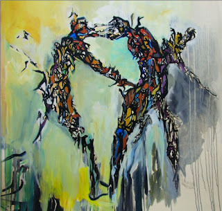
Today was my very first productive day in the studio. I did some doodles and background painting on canvas. I remember how fearful I was to put a piece of line on a paper before, since I was afraid of not making it perfect. Such an engineered mind! It hasn't been so long though that I now feel much more comfortable with my pens and pencils, quicker and more relaxed than yesterday. I tried so many things, but the sketches didn't feel right at the end. However, I saved them with little movements instead of sending them to the garbage bin right away. They are still far from being good, but who cares! I enjoy a lot! I work like a child again while discovering my tools, playing with different things and teach myself one more time that every moment is already perfect and you don't have to worry about making it.
That's why today felt so good...
Tuesday, September 14, 2010
Monday, September 6, 2010
I said I had been trying to catch up Vancouver since I came back. Thanks to Beata Kacy. She helped me re-focus, work and have fun from my photography again. We had a pregnancy project and did some series of shots beside her belly casting. Here are a few photos from the project.
If you wanna see more, please go to the website http://ginger.soigne.ca/, which she made for her lovely girl, Ginger :)
Underwater
Studio
Vintage
 |
| Photography: Guzin Taskiran Editing: Beata Kacy |
Bell Casting
 |
| Bell Casting: Guzin Taskiran Photography: Roksan Kohen Editing: Beata Kacy |
Roksan Kohen
Before I went to Turkey, I had started doing a website for my friend, Roksan Kohen. She is a great artist. I love her work. Her art is alive and so meaningful for me.
It was a great pleasure for me to help her build a new website. Her main requirement was to be able to update her images in the gallery without needing anybody, which was impossible on her previous website. This is what I have designed for her.
http://www.roksankohen.com/
As simple as it could be, yet to the point. I used the Slideshowpro Director to manage her galleries and feed the flash based slide show component on her website. Now, she enjoys having a total control on her albums and being able to change the content herself.
 |
| by Roksan Kohen |
http://www.roksankohen.com/
As simple as it could be, yet to the point. I used the Slideshowpro Director to manage her galleries and feed the flash based slide show component on her website. Now, she enjoys having a total control on her albums and being able to change the content herself.
Wednesday, September 1, 2010
I'm back...
It has been quite a long time since my last post here! Almost 5 months... I was busy with lots of projects and of course graduation. Before I move on, I just wanted to share a few photos from the show. Here are some of my works at display...
And great instructors of the program... They were and are truly amazing!
 |
| with Tene Barber |
 |
| with Jessica Rush |
 |
| with Greg Treadwell |
Almost a week after my graduation, I went to Turkey to visit my family and friends after more than 3 years. I came back on July 30th but it took me almost a month to get back on track again. But here I am! Refreshed and ready to work on new projects :)
Tuesday, April 6, 2010
Grad Show Poster
Last week, we had a shift from what we were doing in web design so far and started to work on our graduation show poster. Maybe because it was about our own graduation or it has been said that it's gonna be challenging and unusually stressful, I was a bit nervous. But I tried to take that challenge as an opportunity to get out from my comfort zone, to look at things differently and get some new set of practice. I reminded myself that even the challenges have their own reasons to be there and what you learn after them is precious. So I got my peace of mind back.
I didn't quite think about visuals for this time. All I wanted was to do something with typography. I even didn't bother to create a mind map, which I used to do all the time in my previous print design projects and have seen it quite helpful. I was uncomfortable, judging my ideas for not having solid concepts yet, but I wanted to do everything different this time. Just play, try things and change it. So, here comes the first poster...
I didn't like it. It was too simple, flat or boring. Without even going really far on that one (actually I tried couple of more on this idea with different colors, longer format and straight positioning), I thought it's not working. My muscles needed some sort of relax because of tension I was creating on myself, so I tried something more fun, still not with a concept but at least playful. I did this one in photoshop.
Ok, I liked it better than the previous one for sure because I've spent much more time on typography and had so much fun but it was not quite there either. I wanted to have some sort of concept, a message to convey to viewer, which was very important for me. I revised my ideas again, but each time I lost more from my confidence, which created some sort of negative thinking that leads to further criticism, skepticism about my skills, creativity. I stopped doing anything on the poster till Sunday. I just wanted to get some fresh idea and got back to my very very first thumb in my sketchbook, which I hadn't even tried yet. I was too scared to apply it because I didn't believe that I have the skills to try what I had in my mind. This one would be heavily inspired by the book, David Berman's "Do Good Design, which Tene had recommended us to read. I was also scared to convey that inspiration truly and nicely to my concept. But I had to give it a try. Here it comes the last one.
I imagined an alley in Vancouver, which was full of electrical wires. I tried to give a feeling of you turning from that alley and coming across with a wall graffiti or writing on a wall. I took the words "Design Can Change" in the sense of the power that design has to change the world. I wanted to keep it as simple as I could in terms of colors or textures to leave the viewer with the message alone. I wanted to have a clean design. I am not very happy about my execution but I am happy that I gave my idea a try. What mattered to me was the effort that I spent on it and the challenge itself.
Monday, March 29, 2010
Luba Lukova
I have met Luba in one of poster design books long time ago and immediately attracted to her work. She has become another woman in my life, who has a strong voice and makes a change through her art. Here is a short but nice article if you wanna know more about her.
http://www.citypaper.com/arts/story.asp?id=3782
Monday, March 1, 2010
Typographic Web Banners


Here are some of not super creative, yet simple typographic web banners that I've made within half an hour. The objective of this assignment was to 'recognize the limitations of typography on the web and explore alternate solutions, to break away from computer generated typography by creating a handmade web banner.' Handmade things are always fun, and also help your mind and hand connection stay in tune.
Monday, January 25, 2010
craft
I took a day off yesterday from crazy type work that we have been doing for weeks now and In-Design. I felt refreshed. I participated a workshop in Octopus Studios and designed a little jewelry. Maybe I wasn't doing any type work but typography is still there. Funny!
Subscribe to:
Comments (Atom)


